
Tags
Common Law Unfair Competition, False Designation of Origin, Federal Trademark Infringement, Federal Unfair Competition, Indiana Trademark Infringement, Joshua P. Kolar, Philip P. Simon
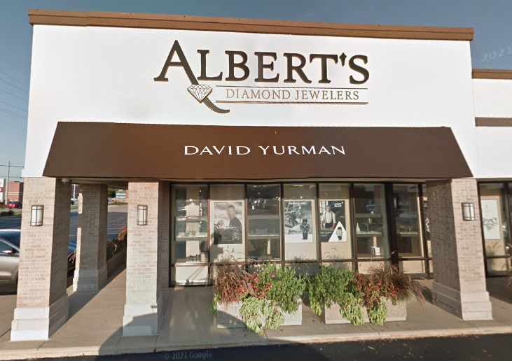
Since 1905, Albert’s Diamond Jewelers has been selling diamond jewelry in Northwest Indiana. In 2002, they adopted the logo seen below when they moved to their current location in Schererville, Indiana. Their logo has not been registered with the United States Patent and Trademark Office.
The logo is described as follows: “The mark prominently incorporates a diamond drawing with sharp edges and a multitude of internal sketch lines, all intended to evoke in a potential customer’s mind a precision cut, high-quality diamond. It’s name “Albert’s” appears above the term “Diamond Jewelers,” and incorporates a distinct style of typeface/font….” See Complaint (below), Section 13.
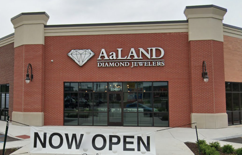
AaLand Diamond Jewelers recently opened a new location in Crown Point, Indiana, which is about 9 miles away from Schererville. AaLand has adopted a logo that Albert’s considers to be “suspiciously similar” to the 21-year old Albert’s logo.
Albert’s reached out to AaLand in late 2022 about their concern, but the parties have not found an amicable resolution. Albert’s initial letter, via counsel, references a single instance of consumer confusion in which an anonymous customer congratulated Albert’s on opening a new store. Albert’s has now filed a lawsuit seeking Court intervention.
I’ll let defense counsel do their job and dig up tons of other photos of similar jewelry store logos, but I can at least compare the parties’ respective logos.
In my opinion, the distinctive elements of the Albert’s font are the swooping, extended arm (leg?) of the “A” and the diamond-shaped asterisk. Neither of those elements appear in the AaLand logo. I wouldn’t be surprised to find out that the AaLand font is just a standard, stock font. Font experts leave a comment below. Albert’s utilizes all capitalized letters, while AaLand features the lower case “a”.
Looking at the two diamonds, they are clearly not identical. They both appear just like what you’d expect a diamond logo to look like, basically what you see on most jewelry store signs. Both are the classic diamond-shape outline with many internal lines depicting facets, just like a diamond. Jewelry experts (and eventually defense counsel) may be able to identify the differences in cuts portrayed on the logos.
Both logos incorporate the generic phrase “Diamond Jewelers,” but the Albert’s logo separates their name from the generic phrase with lines both above and below. The generic phrase is about 5/7 the width of the Albert’s name. The AaLand name is the same width as the generic phrase and separated by one line, which is also the same width as the wording.

If these two jewelry stores weren’t 9 miles apart, would there be any problem? Does close proximity (9 miles) override the ability to use generic elements in your logo? AaLand apparently doesn’t think so based off just one anonymous instance of consumer confusion.
Stay tuned for AaLand’s response to Albert’s Complaint.
Albert’s Diamond Jewelers, Inc. v. AaLand Diamond Jewelers LLC
Court Case Number: 2-23-cv-00039-PPS-JPK
File Date: February 1, 2023
Plaintiff: Albert’s Diamond Jewelers, Inc.
Plaintiff Counsel: Gary E. Hood of Hood Legal Group PC, Daniel W. Glavin of O’Neill McFadden & Willett LLP
Defendants: AaLand Diamond Jewelers LLC
Cause: Federal Trademark Infringement, False Designation of Origin, Federal Unfair Competition, Indiana Trademark Infringement, Common Law Unfair Competition
Court: Northern District of Indiana
Judge: Philip P. Simon
Referred To: Joshua P. Kolar
Complaint:
